This is my final animation. It took about 3-4 hours over 2 hours. I set the camera on a tripod which, although moves sometimes, made the animation fairly steady and used two coloured marker pens. I used one of the ideas from Kristroferstrom's video where he used his finger to interact with the animation. I think my final animation was quite successful even though the characters and scenes were very simple. It is quite smooth flowing and has a simple but nice story-line.
To improve I could have been extra careful to make sure the tripod didn't jog at all and I could have added music to fit with the story.
These are the things that I used for this animation:
a whiteboard
-2 pens
-a tripod
-Kitchen roll to rub out
For my final animation, I decided that it would be a whiteboard animation about a little fox who lived under a tree. The tree would change through the 4 seasons throughout the animation. For this I needed just two characters: The fox, and a child who appears briefly when it is winter. I a few different ways foxes have been pictured in films:
The Fox and the Hound (Disney)
The fox character in "The fox and the Hound" is very simple and used block colours. The facial expressions are very humanised and give the look of a typical cartoon.
Pablo the Little Red Fox (children's TV show)
The character designs for Pablo the Little Red Fox are incredibly simple and little detail. Very few colours are used and the expressions are very simplified. I think this type of character design would be a good option for an animation using a whiteboard because of the limited space I can draw in.
Fantastic Mr. Fox
The characters in "Fantastic Mr. Fox" are models so i wouldn't really be able to use them for a white-board animation but I thought the designs are interesting and it was a good example of an animation using foxes. All the characters in the film are very humanised ans are given very human-like qualities.
My Own Designs
I then decided to draw some more styles of foxes that could potentially be used in my final animation:
Manga
Here is an example of a fox drawn in a Manga style. The manga style often uses big heads, big eyes and exaggerated expressions. I drew this fox on paper and then scanned it into the computer to colour it in on DrawPlus.
Line-Sketch
This type of design is more detailed than the Manga style but isn't detailed enough to be a realistic line-drawing. I drew it from the help of a few photographs I found. After drawing this, I decided that this style couldn't really be used in my whiteboard animation because it took quite a while to draw.
Line Drawing
This is a very, very simplified line drawing of a fox. I think this type of drawing would work best with the whiteboard animation because it is easy to change and doesn't take too long to draw and modify.
I wanted to try out some more styles of animations so while I was on holiday I completed two short animations, one using people and another using a whiteboard and marker pen.
Whiteboard Animation - Dog at the Beach
I think this animation was more successful than the paper animation but still could be improved in many ways. On holiday, I didn't have a tripod so had to hold the camera and try and use the edge of the whiteboard as a guideline but when put together and animated, it is still very jumpy . I think I concentrated on the story line rather than the animation itself and I don't think the story of this animation works for a whiteboard experiment. The figures I drew were very simple but when working with a whiteboard and marker pen, I couldn't really make them very detailed. This was partly inspired by the "Hitch-Hiker's Choice" animation by "Kristroferstrom" but "Hitch-Hikers Choice" was very imaginative which is what I think my animation is lacking.
Photo Animation
This was a very experimental animation I tried where I asked my brother to jump and I took a picture while he was in mid-air to make it look like he was flying when I put all the images together. It took quite a long time to get the picture perfect because often I took the picture too late or too early. Although this is very short and doesn't have a story, I think the style and idea has a good potential to make a good animation and I think the "flying" idea was quite successful.
Humans walk differently to humans and so I decided to create a mini experiment, exploring the human walk cycle. I found this image showing the main 4 stages of the human walk cycle.
I then decided to draw each of these stages in a simple stick-figure form and animate it. I used a program called Drawplus and used its StopFrame Animation option. I could design my animation frame by frame and instead of pictures (like in my previous paper animation) I was using drawings on the computer:
When I had put it all together and exported it as a video file, it looked like this:
Here is an animation that me and 3 other people worked together in our lesson time:
I don't think this animation worked as well as we planned for a number of reasons. Firstly, the camera kept on moving giving the jumpy movement of the page. This could have been prevented if we used a tripod to mount the camera onto.
Another problem that we only noticed until after we had finished shooting was that the lighting changes from one picture to another. This may have been because the camera used flash for some photos and not for others or it could have been because the natural lighting in the room changed. To fix this problem, we should have either left the flash on all the time or turned it of and use a room with controlled lighting (eg. block out natural light and use artificial lights when shooting the photos)
It was also very quick even though it didn't have a very high number of frames per second. It didn't have a very well planned out story line and I think we should have prepared the story more thoroughly to make the content of the animation more interesting to watch. We could have increased the number of photos we took and given it a higher number of frames per second so that it ran much smoother and wasn't so jumpy.
I found some examples of all different types of animations on YouTube. Here are some of them I liked and wanted to write about:
Hitchhikers Choice
This white-board animation by "Kristoferstrom" Interested me. It is incredibly imaginative and creative and has many transformations (something changing to something else). He gave me many ideas for what I could potentially try for my animation. I thought this animation was very creative and very well put together. It was extremely smooth and must have a very high rate of frames per second to achieve this. I liked the way that his finger and hand would interact with the animation and change it.
Rymdreglage - 8-bit trip
This was created by a group of people who call themselves "Rymdreglage" on YouTube. It is an animation made entirely of Lego. I liked this approach to animation because Lego is a common, every day object. I think this is one of the reasons that this animation is so good. Because of the block shapes, the animation looks like a video game made of pixels and this is reflected in the content of the animation because it is about computer games. I thought this was an excellent example of taking something simple, in this case Lego, and creating something amazing from it.
Wallace and Gromit
Wallace and Gromit is directed by "Nick Park"and is a well known show about a man and dog. The characters are 3D Plasticine models so they are easy to move. Wallace and Gromit is a classic example of stop-motion-animation with a very high number of frames per second, making the animation very smooth flowing with realistic movements. This is because it is a professional TV show and and lot of time and care would be taken over each episode to make sure it is perfect.
Autumn Story
This is a chalkboard animationcreated by Yanni Kronenberg that is a music video to the song "Autumn story". It includes many transformations that are cleverly thought over and done very well. Some of these transformations are unexpected and very clever the way a shape becomes something else (eg. the boat and the eye) The whole animation is very creative and I liked how the rubbing-out of the previous drawing could still be seen as it gives it a sense of time passing and movement and it gives the animation a real "chalkboard" feel to it.
Paper Horse Test
This was by a YouTube user called "Nosnoma" and is more of a test rather than a proper animation with a story-line. It is made using paper and paper cut-outs. There is almost no detail on the characters and the idea is simple but it would have taken a lot of care and a very long time to perfect this experiment. I thought it was very clever and an interesting experiment. The movement of the horse is much like Eadweard Muybridge's galloping horse experiment but in a different concept and I find it interesting that such an early animation idea is still being used in animations and experiments today.
Her Morning Elegance
This is a photographic animationby a group of artists and animators who call themselves "QuarterPastWonderful". It is made from a series of images involving people and every time a picture is taken, the models move and then another picture is taken etc. I like it because it takes simple, everyday objects and things and turns them into something else creative, imaginative and inspiring.
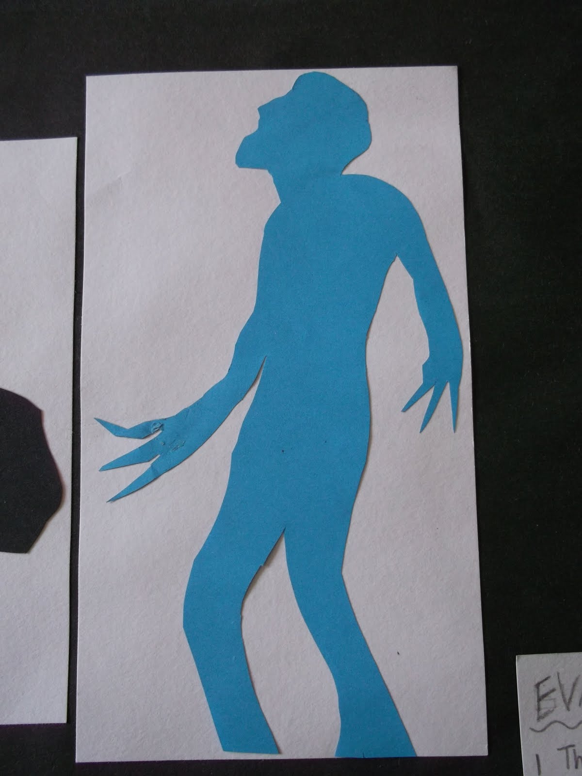
I simplified from the figure drawings and tried cutting out some shapes. These ones were figures from movie posters. I cut them out without drawing a guide-line first. This made the task quite difficult to do without planning proportions first.
By cutting out these paper silhouettes, I learnt to look more closely at the outline of a picture before drawing it and that planning and thinking ahead whilst sketching can make the outcome much better and more accurate.
Here are some other paper cut-outs of animals that I tried but I drew them before I cut them out.
 These are the things that I used for this animation: